 If there’s a clumsier implementer of technology than Cineplex - Canada’s largest movie theatre chain - I’d like to see it. Two years ago, I wrote about how the company had finally introduced a mobile app that wasn’t really mobile - you can buy tickets with it, but you still need to either print them out at home or scan your phone at an automated kiosk at the theatre itself.
That’s still the case, and with more people using that second option, the lineups at those kiosks are growing. Tell me again: what’s the point to buying in advance if you’re going to stand in line anyway? The problem could be solved, now as then, with scanners that zap your truly mobile ticket on your phone at the point of entry. For some reason, that simple logical answer is still escaping Cineplex.
The other day I saw a promotion at my local grocery store: buy a 12-pack of Nestea iced tea and get a two-for-one admission coupon to Cineplex. Well, how could I resist? I like iced tea and I like movies. What could go wrong?
For one thing, there’s the fine print. The voucher, printed on the inside of the box, is only good for Sunday through Thursday. My wife and I usually go to the movies on Friday night, so that’s a bit of a bummer. We’re going to have to make an exception one week, but okay, fine. You suckered me, Nestea.
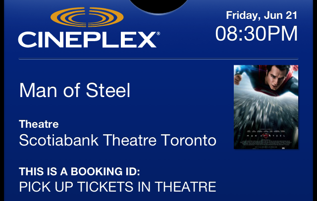
However, the voucher isn’t really a voucher - it’s merely a code that you have to punch in by going to a special website. It’s only once you get there that the real shock kicks in.
Clicking on “How to redeem your code(s)” turns up a 10-page PDF with 14 steps on how to claim your ticket. You read that right: 14 steps! You can actually cut that down to 12 if you’re not a Scene rewards member (I am) and if you’re not paying by gift card, but still… 12 steps!
Somebody needs to tell Cineplex this is 2013 - the only thing that still requires 12 steps is getting over alcoholism. If technology is involved, that’s simply out of the question.
And, as if the day limitation and the onerous process still wasn’t enough to convince any sane person to say “screw it,” you also have to select a specific theatre, movie and time at the end of all of it. In other words, using this “free” movie ticket is going to require more planning than my next vacation.
That’s Cineplex for you - making your movie-going experience as hellishly inconvenient as possible.


Marc Venot
June 26, 2013 at 1:44 am
The voucher should provide only a free access but by this hellish procedure it gives also priority.
Movie Buff (but not in the buff)
June 26, 2013 at 12:01 pm
I wrote a mobile app for the Palm wireless devices back in the late ’90′s. It was a very popular app for its time (Palm gave out 10,000 copies to attendees at the 2001 Cannes Film Festival) so it caught the eye of a Palm guy working in their verification group. He provided invaluable feedback. The comment that stuck with me most was, “If you can save half a tap, it’s worth fixing.”
Of course, it’s impossible to save HALF a tap but his point was that you need to make things as efficient as possible for users. The term we use now is to lower friction. That’s so apt. I’ve lost count of the number of times I’ve abandoned some process because it was needlessly cumbersome. Tune and refine your process until the user interaction is as little as possible.
One other example …
Accessing monthly statements on the RBC web site is about as cumbersome as can be. Since I do this every month what I would expect is that after I’ve logged into the site that one (1) click would download ALL statements. No, it takes 16 clicks!!! That’s 15 more clicks than there should be. Looks like someone is being paid by the click.
I gave that feedback to the RBC webmaster and my investment rep 15 months ago. Nothing has changed. They don’t give a .
And how about the app and web designers that make you do frequent actions by clicking on diagonally opposite parts of the window. What are they thinking? [Rhetorical question]
redneckonthetrain
June 26, 2013 at 2:42 pm
Usability is something every company should look at more. Having made a relatively short sojourn into the world of design and usability I can confidently say almost every company fails miserably at this. From cars, to movies, to toasters, to app programming there is an abhorrent lack of usability. It’s no wonder people find technology so frustrating and apple does so well.
I must say in this specific case, you good Sir, have been a victim of anti usability design. Yes the marketing department had a good idea but then the bean counters felt they needed a way to marginalize their losses. And thus a 14 stage process was born.